Accessibility Toolkit
A comprehensive accessibility solution for enhancing web application usability with features like screen reader support, contrast adjustment, text customization, and more.
Accessibility Toolkit
A comprehensive, free, and open-source accessibility toolkit for React applications. Built with TypeScript and Tailwind CSS, it provides essential accessibility features without any external dependencies or tracking.
Installation
CLI
Manual
Quick Start
Once installed, the accessibility toolkit will automatically add a floating accessibility button to your application. Users can:
- Click the accessibility button in the bottom-right corner
- Use the keyboard shortcut
Ctrl+U(orCmd+Uon Mac) to open the accessibility panel - Navigate through different accessibility options using tabs
- Customize their experience with various accessibility features
Features
The Accessibility Toolkit provides a comprehensive set of features organized into four main categories:
Vision Adjustments
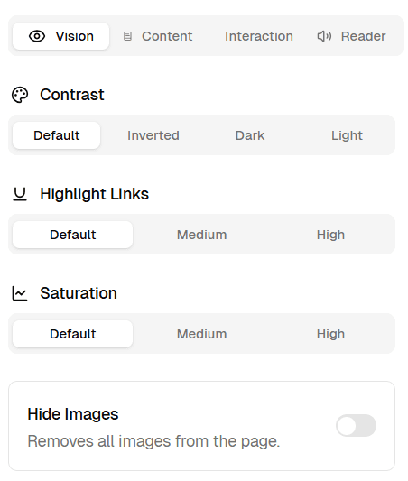
Contrast Enhancement
- Default, Inverted, Dark, and Light contrast modes
- Helps users with visual impairments and light sensitivity
Link Highlighting
- Three intensity levels for making links more visible
- Adds outlines and background colors to improve link identification
Color Saturation
- Adjust color intensity from normal to grayscale
- Helpful for users with color sensitivity or visual processing disorders
Hide Images
- Toggle to hide all images on the page
- Reduces visual clutter and distractions
Content Adjustments
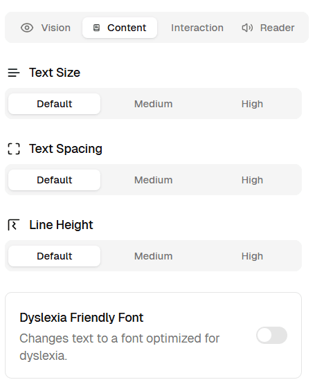
Text Size
- Three levels: Default, Medium (1.2x), High (1.5x)
- Improves readability for users with vision impairments
Text Spacing
- Adjustable letter and word spacing
- Enhances readability for users with dyslexia
Line Height
- Customizable line spacing for better text flow
- Reduces visual crowding between lines
Dyslexia-Friendly Font
- Toggleable OpenDyslexic font
- Specially designed for users with dyslexia
Interaction Features
Cursor Size
- Adjustable cursor size for better visibility
- Helpful for users with motor impairments or vision issues
Keyboard Shortcuts
- Built-in keyboard navigation support
- Complete accessibility panel control via keyboard
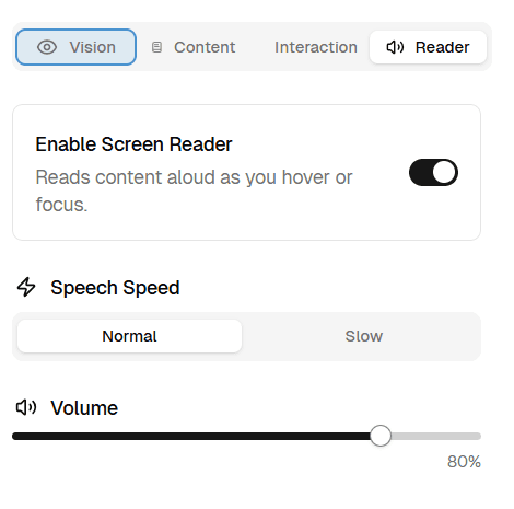
Screen Reader
Built-in Text-to-Speech
- Native JavaScript implementation
- No external dependencies or third-party services
Hover and Focus Reading
- Automatically reads content as users navigate
- Supports all interactive elements
Customizable Settings
- Adjustable speech speed (Normal/Slow)
- Volume control with visual indicator
- Visual highlighting of currently read elements
Component Architecture
The toolkit is built around a single main component with integrated functionality:
AccessibilityUI
The main component that wraps your entire application and provides all accessibility features.
Props:
| Prop | Type | Description |
|---|---|---|
children | React.ReactNode | The content to be wrapped by the accessibility provider |
Key Features
Floating Trigger Button
- Fixed position button in bottom-right corner
- Visual indicator when screen reader is active
- Accessible via keyboard navigation
Responsive Sidebar Panel
- Slides in from the right
- Fully keyboard accessible
- Organized tabs for different feature categories
- Responsive design that works on all screen sizes
Persistent Settings
- All preferences saved to localStorage
- Settings persist across browser sessions
- Reset functionality to restore defaults
State Management
The toolkit uses Zustand for state management with the following store structure:
AccessibilityStore
Type Definitions
CSS Implementation
The toolkit applies accessibility features through CSS classes added to the <html> element:
Contrast Classes
.contrast-medium- 150% contrast.contrast-high- 200% contrast.contrast-windows-inverted- Full color inversion.contrast-windows-dark- Dark mode styling.contrast-windows-light- High contrast light mode
Text Enhancement Classes
.text-size-medium- 1.2x text size.text-size-high- 1.5x text size.text-spacing-medium- Increased letter/word spacing.dyslexia-friendly- OpenDyslexic font family
Visual Feature Classes
.highlight-links-medium/high- Link highlighting with outlines.hide-images- Hides all images and media.cursor-medium/high- Enlarged cursor sizes.screen-reader-highlight- Highlights currently read elements
Screen Reader Service
The built-in screen reader service provides:
Automatic Content Reading
- Reads content on hover and focus events
- Intelligent element detection and text extraction
- Support for form elements, links, buttons, and headings
Text Processing
- Extracts appropriate text from different element types
- Handles ARIA labels and accessibility attributes
- Provides context for interactive elements
Visual Feedback
- Highlights currently read elements
- Prevents re-reading of the same content
- Smooth transitions between elements
Keyboard Navigation
The toolkit supports full keyboard accessibility:
Shortcuts
Ctrl+U(orCmd+U) - Toggle accessibility panelTab- Navigate through elementsEnter- Activate focused elementEsc- Close dialogs and panels
Focus Management
- Proper focus trapping within the accessibility panel
- Clear focus indicators throughout the interface
- Logical tab order for all interactive elements
Browser Compatibility
Tested and supported browsers:
| Browser | Version | Screen Reader Support |
|---|---|---|
| Chrome | 76+ | ✓ Full support |
| Firefox | 70+ | ✓ Full support |
| Safari | 13.1+ | ⚠︎ Limited speech synthesis |
| Edge | 79+ | ✓ Full support |
| iOS Safari | 13.4+ | ⚠︎ Limited speech synthesis |
| Android Chrome | 76+ | ✓ Full support |
Performance Considerations
The toolkit is designed for optimal performance:
- Lightweight: Minimal JavaScript bundle size
- Lazy Loading: Features are only active when needed
- Efficient Rendering: Uses React’s built-in optimization
- Memory Management: Proper cleanup of event listeners and services
Accessibility Standards Compliance
The toolkit helps meet various accessibility standards:
WCAG 2.1 AA Compliance
- Perceivable: Visual adjustments, screen reader support
- Operable: Keyboard navigation, customizable interactions
- Understandable: Clear UI, consistent behavior
- Robust: Cross-browser compatibility, assistive technology support
Legal Compliance Support
- Americans with Disabilities Act (ADA)
- Section 508 of the Rehabilitation Act
- European Accessibility Act (EAA)
- Web Content Accessibility Guidelines (WCAG)
Comparison with Commercial Solutions
Advantages Over Paid Services
| Feature | Commercial Tools | Accessibility Toolkit |
|---|---|---|
| Cost | $490+/year | Free & Open Source |
| Privacy | Data collection | No tracking |
| Customization | Limited | Full control |
| Integration | External scripts | Native React |
| Performance | Additional HTTP requests | Bundled with app |
| Maintenance | Vendor dependency | Self-maintained |
Feature Comparison
| Feature | UserWay | accessiBe | This Toolkit |
|---|---|---|---|
| Screen Reader | ✓ | ✓ | ✓ |
| Contrast Adjustment | ✓ | ✓ | ✓ |
| Text Customization | ✓ | ✓ | ✓ |
| Keyboard Navigation | ✓ | ✓ | ✓ |
| Self-Hosted | ✘ | ✘ | ✓ |
| Open Source | ✘ | ✘ | ✓ |
| Custom Styling | Limited | Limited | Unlimited |
| GDPR Compliant | ⚠︎ | ⚠︎ | ✓ |
Best Practices
Implementation Guidelines
Start Early: Implement accessibility features during development, not as an afterthought.
- Use semantic HTML elements alongside the toolkit
- Test with actual screen readers (NVDA, JAWS, VoiceOver)
- Ensure keyboard navigation works without the toolkit
- Regular accessibility audits and user testing
- Provide alternative text for images and media
Common Pitfalls to Avoid
Don’t Over-rely: This toolkit enhances accessibility but doesn’t replace proper semantic HTML and ARIA attributes.
- Assuming the toolkit covers all accessibility needs
- Not testing with users who have disabilities
- Ignoring mobile accessibility
- Poor color contrast in base design
- Missing focus indicators for custom components
Customization
Styling
The toolkit uses Tailwind CSS classes and can be customized by:
Adding Custom Features
Extend the toolkit by adding new features to the store:
Troubleshooting
Common Issues
Screen Reader Not Working
- Check browser compatibility
- Ensure HTTPS connection (required for speech synthesis)
- Verify audio is not muted
Styles Not Applying
- Confirm CSS is imported in your global styles
- Check for CSS specificity conflicts
- Ensure Tailwind CSS is properly configured
Performance Issues
- Disable features not needed for your application
- Check for memory leaks in custom implementations
- Monitor bundle size impact
Contributing
We welcome contributions to improve the accessibility toolkit:
Ways to Contribute
- Report bugs and suggest improvements
- Add new accessibility features
- Improve documentation
- Create examples and tutorials
- Test with different assistive technologies
Development Setup
Roadmap
Planned features for future releases:
- Voice Commands: Navigate using voice recognition
- Reading Ruler: Visual guide for line-by-line reading
- Animation Controls: Reduce motion for sensitive users
- Color Blindness Simulator: Test color accessibility
- Advanced Keyboard Shortcuts: More navigation options
- Multi-language Support: Localized screen reader voices
License
This accessibility toolkit is released under the MIT License, making it free for both personal and commercial use.
Remember: Accessibility is an ongoing journey, not a destination. This toolkit is designed to be a starting point for creating more inclusive web experiences.